


Eight Atomicdust Projects Featured in AIGA St. Louis Design Show 28
Atomicdust didn’t win any Judges Choice Awards at the 28th Annual AIGA St. Louis Design Show—and we’re still thrilled.
Last week was a pretty great week for Atomicdust. First off, we’re busy. Slammed actually. So busy that it was hard to find the time to even write this blog post, and for that we are really thankful.
Secondly, the whole crew (and their plus ones) headed down to Cancun, Mexico for a company trip. We sat on the beach, destroyed the buffet, and spent some much needed downtime together. Not a meeting, trust fall or EOS book in sight. Just hanging out.
And while that was great, the night before we flew down was the AIGA St. Louis Design Show. The event is a gallery show of the best design and creative work in St. Louis from the past year. It’s the show we strived to be included in for years.

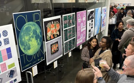
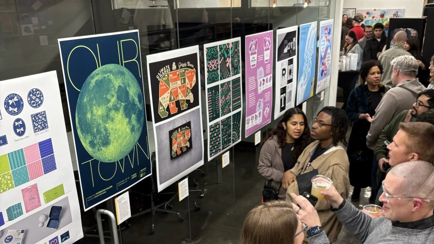
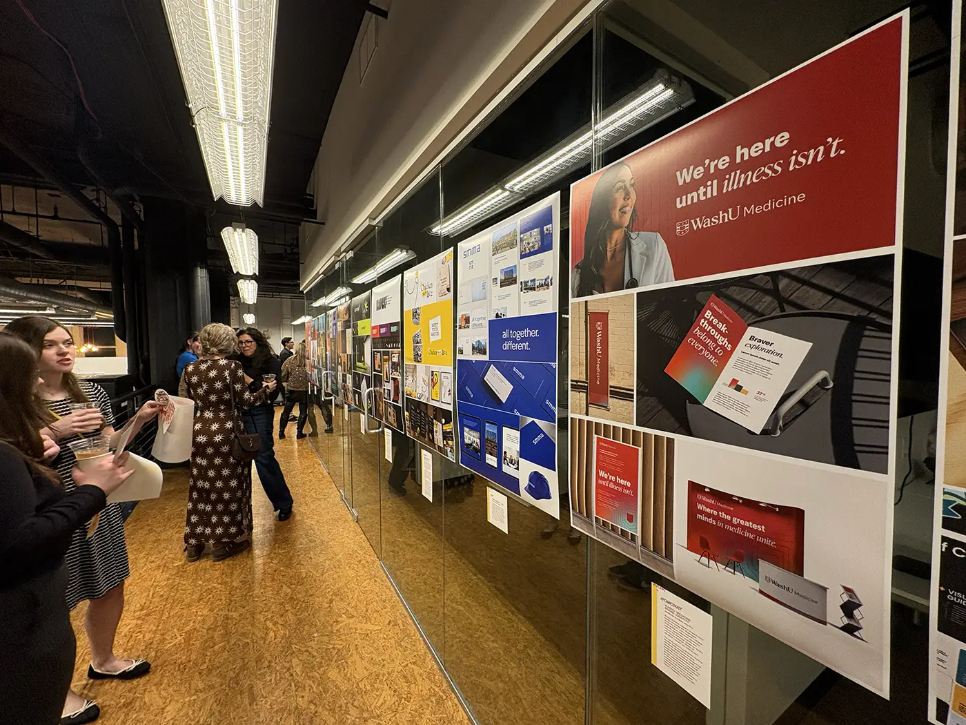
Atomicdust website design projects on display at the 28th Annual AIGA St. Louis Design Show
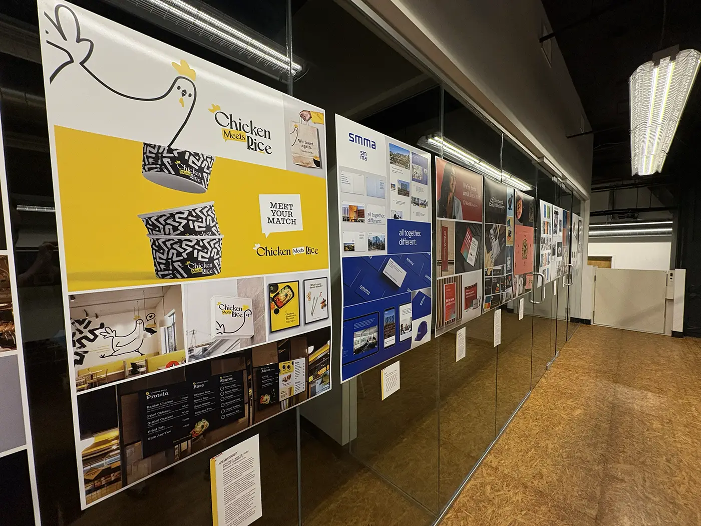
Two of Atomicdust’s three branding projects that were featured in the show
Atomicdust Creative Director Katie Pour and I had a ritual in the early days of Atomicdust: submit work, then nervously pound chips and salsa at a restaurant in Soulard the night of the show, hoping that our work had been included.
Spoiler alert: We never were. It took us eight years to even get a piece of work into the show. And we were super stoked to see it hanging on those walls.
This year, AIGA St. Louis had told us ahead of time that our work had been accepted, but we didn’t know what projects, or how many, until we showed up. We walked in and found eight of our projects had been accepted, and were thrilled.
This is the AIGA St. Louis Design Show’s 28th year, and it’s important to us more than ever—but for other reasons than just recognition and accolades.
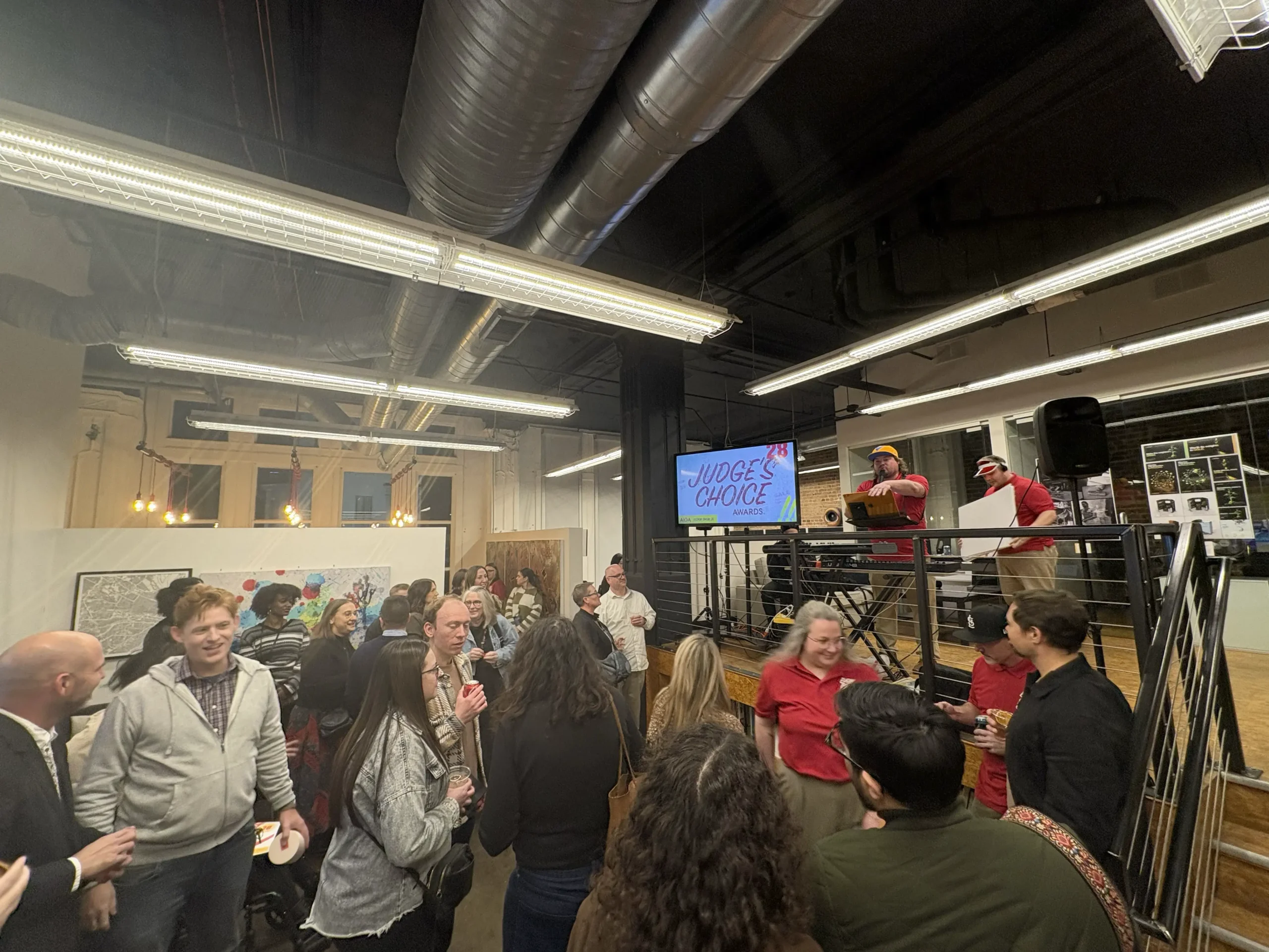
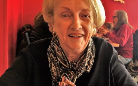
Local creatives mingle and celebrate work at the AIGA St. Louis Design Show 28
Branding and design work at the AIGA Design Show

Attendees check out the accepted student work at the show
The AIGA St. Louis Design Show brought the local scene together.
The creative scene in St. Louis is much bigger than you probably think. Our city was a bustling hub of advertising when Anheuser-Busch was headquartered here. But a lot has changed since then: the sale of AB, the pandemic, the decline in funding for the national AIGA organization, AI madness, and the nature of remote work changing everything.
The creative scene in St. Louis has taken a beating. Or at least, seems to be a shadow of what it once was.
This is the scene (and network of people) that helped me build my career, my reputation and my agency. I never want to see it fade away to black… deep black, like a designer’s cliché turtleneck.
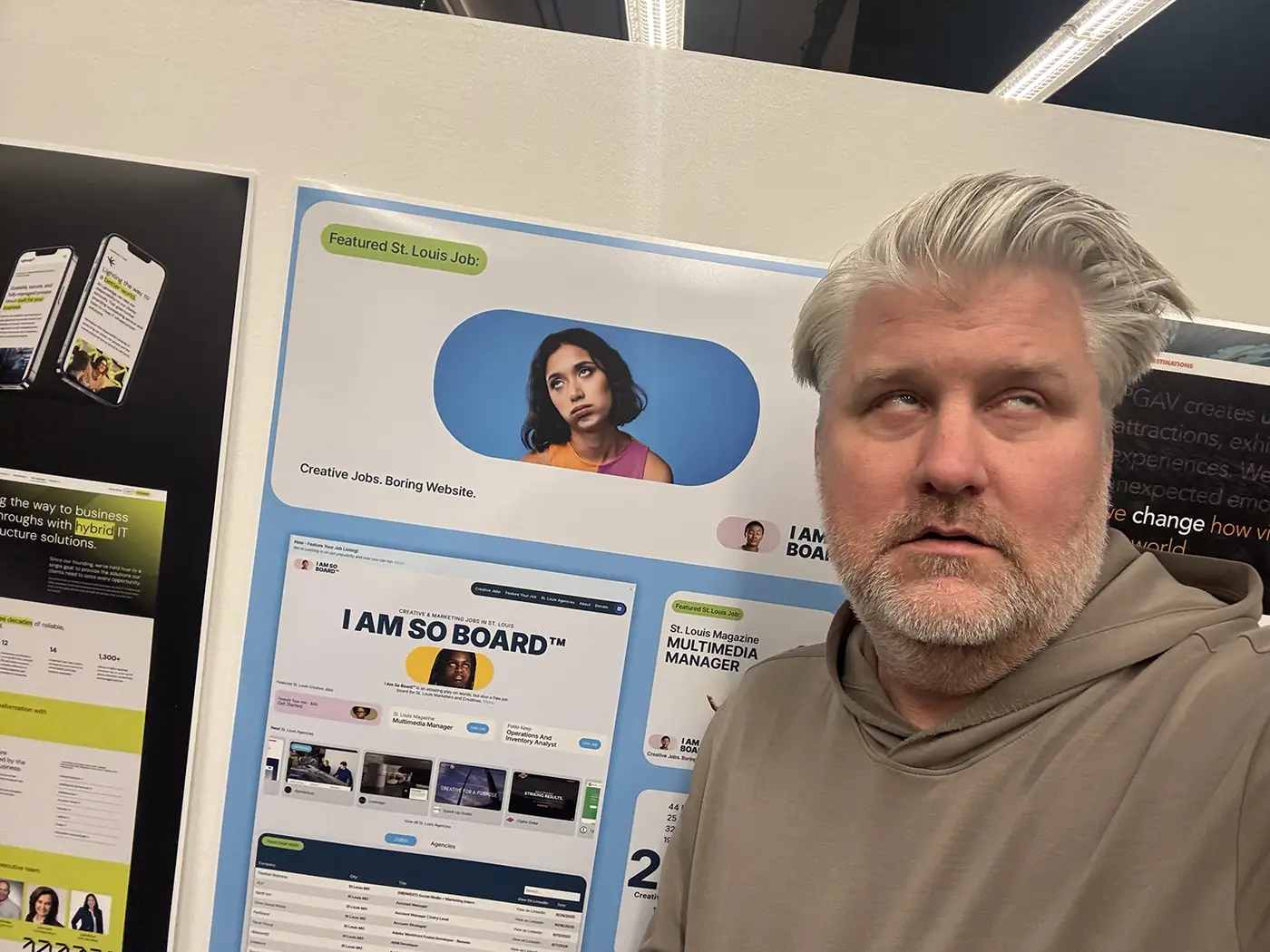
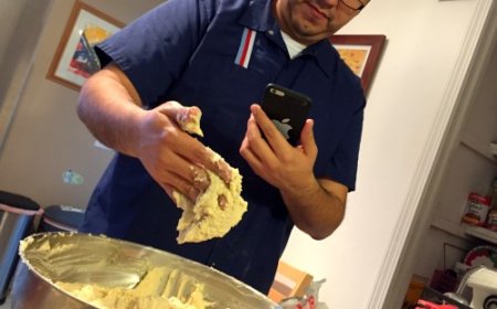
Mike ridiculously posing like the I Am So Board brand.
But the AIGA St. Louis Design Show this year felt like a turning point.
It proved we still have a vibrant scene in St. Louis, we still produce great work, and that a little friendly competition is good for everyone.
Shouts out to the winners, the judges, and the sponsors. And shouts out to AIGA St. Louis. Your efforts and ability to keep our traditions happening mean a lot. Your grit is bigger than your lack of funding, and thanks for all you do to keep the creative community in St. Louis alive.
Take a look at the Atomicdust projects that were showcased among St. Louis’s top design talent:
Acosta Website Design
Acosta’s complex retail and sales services needed clarity online. We simplified messaging, organized content around industries and business challenges, and highlighted client success with filterable case studies and human-focused photography. The scalable design system ensures the site grows with the brand, reflecting Acosta’s role as an innovative leader in the grocery industry. (It’s also a great example of St. Louis creatives teaming up—we partnered with the talented team at Integrity to make it happen.)
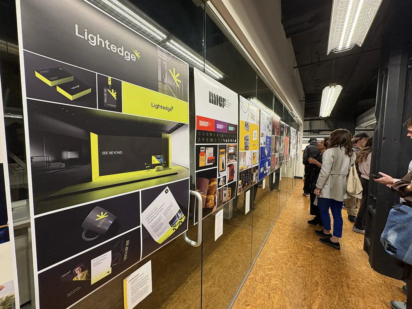
Lightedge Website and Branding
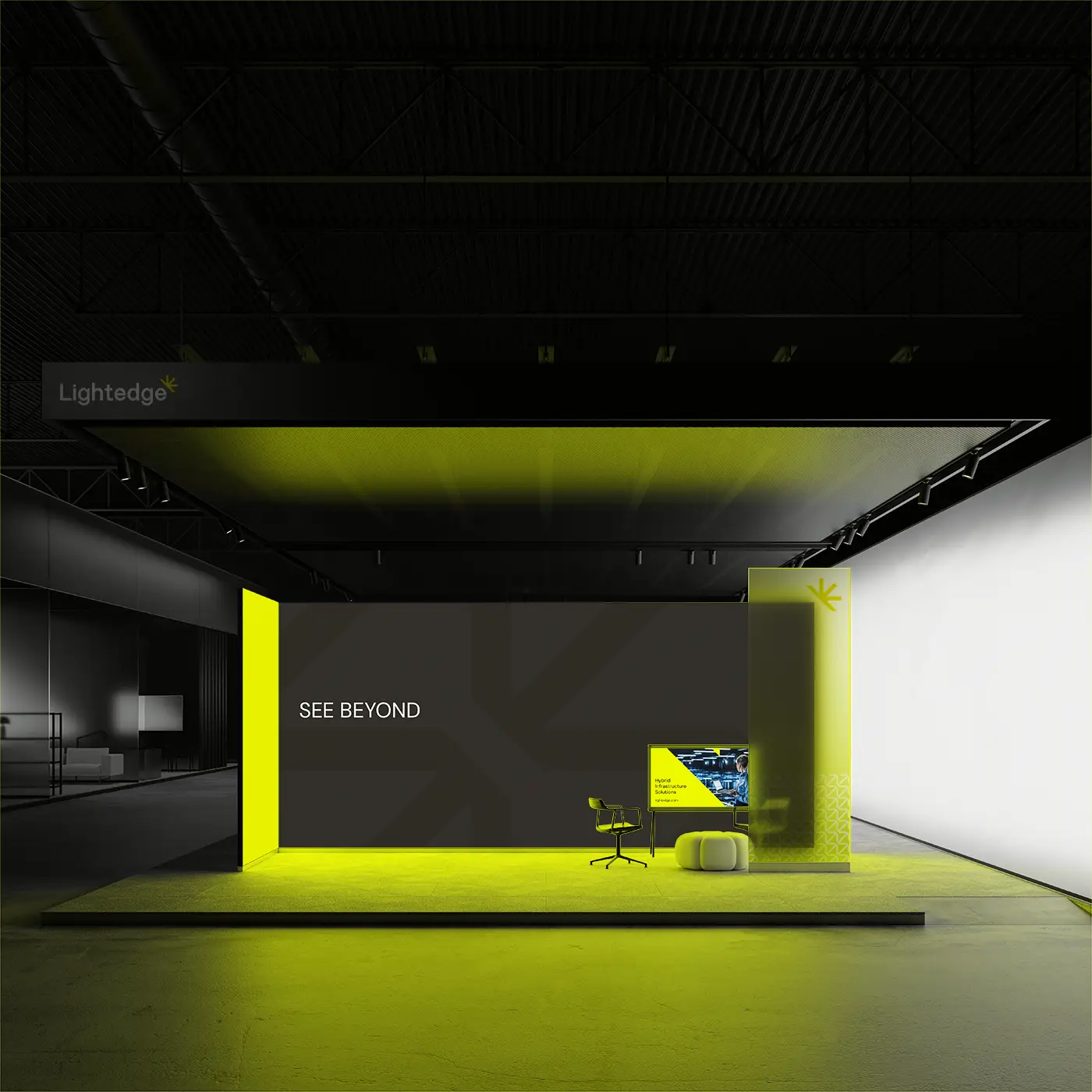
After a merger, Lightedge needed a unified identity and digital presence that honored both companies’ legacies while signaling a bold, forward-looking future. We created a cohesive brand centered on the promise “See Beyond,” reflecting the company’s consultative approach and focus on real business solutions.
The visual identity pairs high-contrast black with highlighter-yellow accents, an angular logo and a sunburst mark that conveys clarity, innovation and momentum. The website brings this identity to life, utilizing a strategic mega-menu, benefit-focused copy, and subtle animations to create an intuitive and engaging experience.
I Am So Board Website
 Job hunting is painful, but this site makes it easier. Inspired by some friends looking for new opportunities and a simple pun, I spent a weekend vibe coding to build I Am So Board. Using AI, automations and API integrations, the website aggregates local creative and marketing job listings into one searchable list and features a directory of over 200 St. Louis design, marketing and creative agencies.
The design of the site pairs photos of bored, unimpressed and exasperated creatives with witty, unpretentious copy. Additional automations create and publish social media graphics, ensuring new positions are promoted on an ongoing basis.
PGAV Website
 Ten years after our team broke industry norms with a site that highlighted PGAV Destinations’ creativity, it was time for a website that matched the full scale of their global expertise. The new PGAV Destinations site features large, immersive images to showcase projects and the people behind them, while a robust content library puts thought leadership at the forefront. Automatic translations and intuitive layouts ensure a universal, trust-building experience for clients worldwide.
WashU Law Website
As WashU unveiled its refreshed brand, WashU Law saw an opportunity to revamp its website. The project came with a long list of goals: in addition to attracting prospective students and staff, it needed to promote the various programs and degrees, spotlight faculty expertise and accomplishments, and continue to uphold the school’s esteemed reputation. The new site blends bold but clear design with thoughtful storytelling, modern animation and a strategic technical structure for an experience that raises the bar for elite law schools around the country.
Chicken Meets Rice Branding
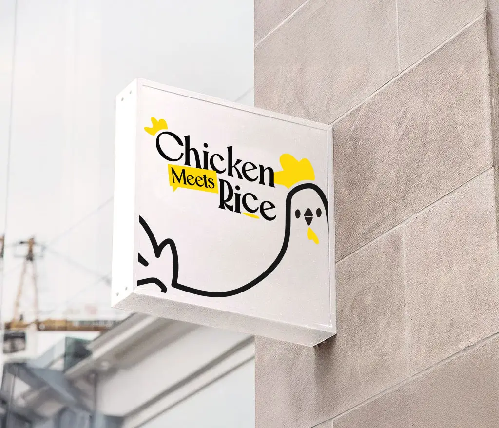 Chicken Meets Rice—a fast-casual Hainan chicken rice concept—wanted to turn their menu passion into a warm, memorable brand. The identity blends thick, rounded typography, a bright color palette and custom icons to highlight regional authenticity. At its heart: a charming, bowl-holding chicken mascot paired with a rhyming, storybook narrative that explains the care behind each slow-poached recipe. The result is a fun, inviting brand that honors tradition while allowing the business to scale.
WashU Medicine Branding
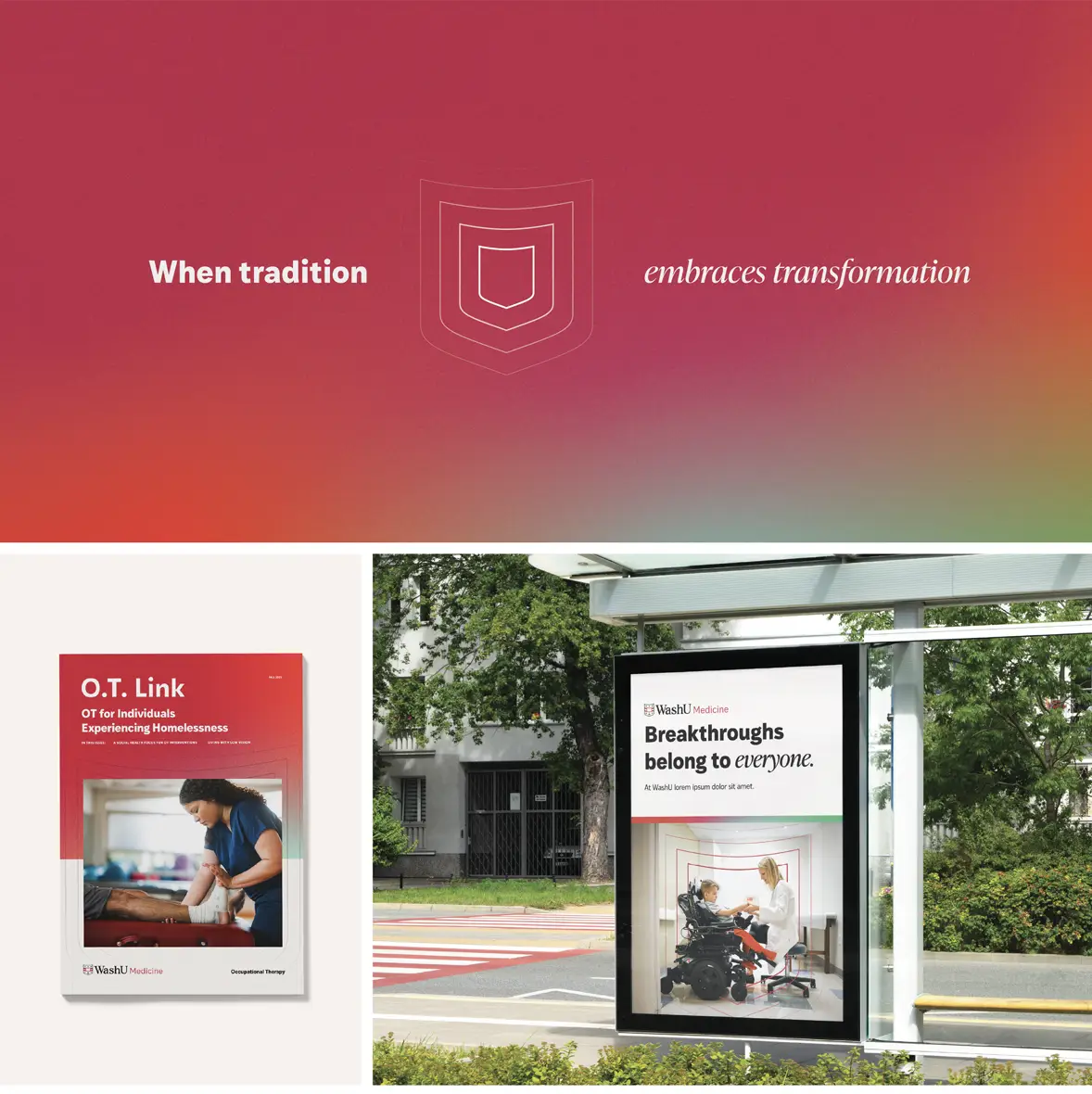 WashU Medicine needed a cohesive brand system coinciding with Washington University in St. Louis’ rebrand to WashU. Serving diverse audiences—physicians, patients, researchers, students and donors—the institution needed an identity reflecting its tripartite mission of education, research and clinical care.
The visual system is packed with meaning. Gradient fields symbolize merging disciplines. Shield patterns representing WashU Medicine’s rippling impact, and empathetic messaging breaks through healthcare’s monotonous language. The flexible, comprehensive system allows people across WashU Medicine’s numerous departments to maintain a consistent brand. The end result balances scientific excellence with human compassion.
Crane Agency 140th Anniversary Digital Ads
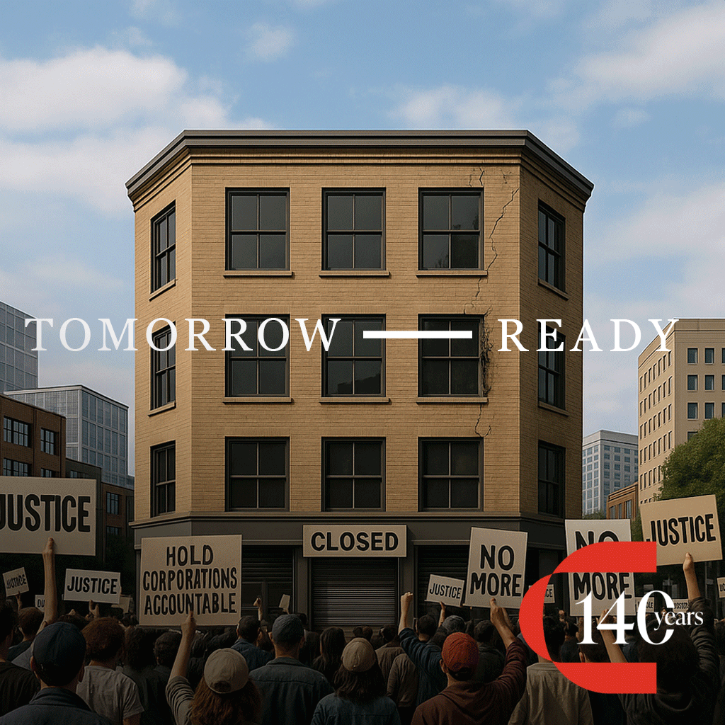
One of the oldest insurance brokerages west of the Mississippi, Crane Agency is celebrating its 140th anniversary. To spotlight their impact, we created a series of social graphics that illustrate how things have changed… and yet how other things, like Crane’s dependability during life’s twist’s and turns, stay the same.
Using thoughtful AI prompts, we developed images that show a similar situation (or in the case of Crane Agents, similar people) spanning the decades. From there, we compiled the images into a gif for a fast-moving experience that mimics the passing of time.
Atomicdust is thrilled to be a creative agency in St. Louis (with an office in the city), and to be part of an amazing scene. Kudos to the AIGA St. Louis, judges and volunteers. If you’re part of the St. Louis creative community—whether you’re looking to build your career or support it—the AIGA St. Louis is worth your investment.
The post Eight Atomicdust Projects Featured in AIGA St. Louis Design Show 28 appeared first on Atomicdust.
What's Your Reaction?
 Like
0
Like
0
 Dislike
0
Dislike
0
 Love
0
Love
0
 Funny
0
Funny
0
 Angry
0
Angry
0
 Sad
0
Sad
0
 Wow
0
Wow
0