The Impossible Mathematics of Vaccine Salvation

Preface
This essay relies entirely on the rigorous analytical work of , Joseph Hickey, and Christian Linard, whose meticulous examination of mortality data and counterfactual claims has exposed fundamental impossibilities in the official COVID-19 narrative. Their courage in pursuing uncomfortable truths despite professional risks represents science at its finest - following evidence wherever it leads. Any errors in interpretation or presentation in this essay are mine alone and should not reflect on their exemplary research.
1. The Three Million Lives
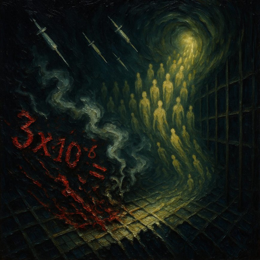
On October 10, 2024, Dr. Peter Hotez sat before Congress and delivered testimony under legal obligation to tell the truth. He declared that COVID-19 vaccines saved 3.1 or 3.2 million American lives and averted 18 million hospitalizations. Without them, he claimed, the United States would have seen 4 million deaths instead of “1-plus million deaths.” These numbers, he assured the committee, came from studies by his “colleague and friend Alison Galvani at Yale.”
The claim originated from a December 2022 blogpost on The Commonwealth Fund website, authored by Fitzpatrick, Moghadas, Pandey, and Galvani. Not a peer-reviewed paper with detailed methodology, but a blogpost. Yet this figure - 3.2 million lives saved - has achieved the status of revealed truth. Major media outlets from the New York Times to CNN have repeated it without question. Yale School of Public Health celebrated it on social media. The number has been carved into the congressional record, transforming speculation into official history.
The transformation of this claim from blogpost to gospel reveals the mechanics of epistemic capture in action. No journalist asked how these researchers could possibly know how many people would have died in an alternate reality. No editor demanded to see the calculations. No fact-checker wondered why such an extraordinary claim appeared first in a blog rather than a scientific journal. The number was simply too useful to question - it justified every policy, every mandate, every violation of bodily autonomy. Three million lives saved meant the vaccines were humanity’s greatest medical achievement. To question this number was to align oneself with death itself.
But Rancourt and Hickey did what no one else would: they took the claim seriously enough to test it. If vaccines really saved 3.2 million lives in two years, then the mortality patterns without vaccination should follow predictable, logical patterns. The counterfactual reality should make mathematical sense. What they found instead was a portrait of impossibility so stark that it demolishes not just the specific claim, but the entire edifice of counterfactual modeling that supports the vaccine narrative.
2. The Counterfactual Shell Game
Counterfactual analysis sounds sophisticated, but it’s essentially elaborate guesswork dressed in mathematical formalism. The premise is seductive: use models to predict what would have happened if an intervention hadn’t occurred. In the case of COVID vaccines, researchers claim to calculate how many would have died without vaccination by modeling disease spread, infection fatality rates, and vaccine efficacy.
The first sleight of hand occurs in the modeling of viral1 spread. Fitzpatrick and colleagues use contagion dynamics modeling, assuming the virus spreads predictably through populations based on contact patterns and transmission rates. But as Hickey and his co-authors have demonstrated elsewhere, the actual mortality patterns during COVID were incompatible with viral spread. Death spikes occurred simultaneously across vast geographic distances, immediately after policy announcements rather than following disease transmission timelines.
The second deception involves vaccine efficacy estimates. The counterfactual modelers treat clinical trial efficacy numbers as real-world effectiveness, despite these trials being, as Rancourt notes, “contrived, questionable and non-transparent.” They assume vaccines prevent transmission and infection at rates that have been thoroughly debunked by real-world data. They ignore negative efficacy periods, waning “effectiveness,” and the mounting evidence of immune system damage from repeated doses.
The third trick is the most insidious: the models assume that without vaccines, nothing else would have changed. No recognition that the ventilator protocols were killing people would have emerged. No adaptation of medical practices would have occurred. No one would have stopped the deadly treatments. The counterfactual world is frozen in March 2020 panic, with ventilators running at full capacity and experimental protocols killing patients, somehow extending this carnage for two full years as if medical professionals would never notice the pattern of iatrogenic death.
Watson et al., using similar methodology, claimed vaccines saved 14.4 million lives globally in just the first year. Yet when Ioannidis and colleagues used actual seroprevalence data rather than contagion models, they found vaccines might have saved only 2.5 million lives globally through 2024 - an order of magnitude less. And when McNamara’s team looked at actual age-stratified mortality data, comparing vaccinated and unvaccinated populations in real time, they found “the magnitude of the impact of vaccination roll-out on deaths was unclear.” The more rigorous the methodology, the smaller the effect becomes, approaching zero.
3. The Impossible Virulence Surge
Rancourt and Hickey’s analysis reveals the mathematical impossibility at the heart of the 3.2 million lives saved claim. For the counterfactual to be true, whatever was causing deaths would have had to become dramatically more lethal at precisely the moments when vaccination campaigns launched. Not gradually, not randomly, but in perfect synchronization with vaccine rollouts.
The actual excess all-cause mortality in the United States never exceeded approximately 25,000 deaths per week throughout the entire pandemic period, including 2020 when no vaccines were available and populations were supposedly most vulnerable. Yet accepting Fitzpatrick’s model requires believing that without vaccines, excess mortality would have reached 150,000 deaths per week in late 2021 and early 2022 - a six-fold increase.
This hypothetical mortality explosion must have occurred twice. First, immediately after the initial vaccine rollout in early 2021 when doses 1 and 2 were administered. Second, immediately after the booster campaign in late 2021. Each time, whatever was supposedly causing deaths became catastrophically more deadly just as the vaccines arrived to save us. The timing is so precise, so convenient, so impossible that it reveals the game: the models were engineered backward from a desired conclusion.
The yearly aggregates expose the absurdity further. Actual excess mortality in 2021 (558,014 deaths) was only 16% higher than in 2020 (482,351 deaths), despite mass vaccination. But the counterfactual claims that without vaccines, 2021 would have seen 2.9 million excess deaths - five times the actual number and six times the 2020 baseline. Whatever caused half a million excess deaths in 2020 would have somehow caused nearly 3 million in 2021, but was prevented from doing so by vaccines that didn’t actually reduce mortality compared to 2020.
4. Geographic Impossibilities
The counterfactual models produce geographic patterns that shatter any pretense of plausibility. When Rancourt and Hickey calculated what mortality would have looked like across different states under Fitzpatrick’s assumptions, they found impossible synchronicities and disparities.
In New York, accepting the counterfactual means believing excess mortality would have been 6.1 times higher in 2021 without vaccines. In Illinois, 6.8 times higher. In California, 5.1 times higher. These multipliers aren’t uniform - they vary wildly between states with similar demographics and vaccination rates. The Bronx, already devastated in 2020, would have somehow experienced even more catastrophic mortality.
The models require believing that mortality patterns would have respected state boundaries with supernatural precision. Texas would have seen a 4.7-fold increase while neighboring states saw different multiples. Florida’s excess mortality would have increased 4.4-fold while Georgia’s increased 4.3-fold - slightly different, but why? The models can’t explain why deaths would have been exactly 5.18 times higher across the entire United States but with state-level variations that make no epidemiological sense.
Most damning is the synchronization problem. All states would have experienced their hypothetical mortality explosions simultaneously, coordinated with vaccination campaigns. Deaths would have increased in rural Montana at exactly the same moment as in urban New York, in elderly Florida at the same time as younger Colorado. This synchronization defies any natural explanation. This is how computer models work when they’re retrofitted to support predetermined conclusions.
5. The Ventilator Massacre
While counterfactual modelers imagine millions saved by vaccines, the actual evidence points to iatrogenic death on a massive scale combined with nocebo-induced illness. Hickey, Rancourt and Linard’s analysis reveals what really drove the mortality spikes: hospital protocols, particularly mechanical ventilation. In New York City hospitals, 88% of patients placed on ventilators died. For elderly patients, the death rate reached 97%.
These weren’t deaths from a spreading pathogen - they were deaths from treatment amplified by fear. The propaganda campaign of 2020 created unprecedented nocebo effects. When people were told a deadly disease was spreading, many developed the exact symptoms they were told to expect. Breathlessness, a primary “COVID symptom,” is well-documented as inducible through nocebo effects. The fear campaign literally made people sick, driving them to hospitals where deadly protocols awaited.
Hospitals used anesthesia machines as ventilators with 70% mortality rates. They split single ventilators between multiple patients despite professional warnings. They sedated patients with midazolam at rates that delayed recovery and increased delirium. They administered hydroxychloroquine at doses ten times normal levels, combined with azithromycin in ways that caused fatal heart complications.
The geographic correlation is undeniable: regions that dramatically expanded ICU capacity and aggressively ventilated patients had the highest death rates. Lombardy created hundreds of new ICU beds and systematically ventilated COVID patients, experiencing catastrophic mortality. Neighboring Veneto focused on home care and avoided the death spike. The pattern repeated everywhere - aggressive treatment combined with fear-induced illness correlated with death, while conservative management avoided mass casualties.
This creates a grotesque irony in the counterfactual claims. The models assume that without vaccines, the combination of deadly protocols and nocebo-induced illness would have continued indefinitely. But the vaccines didn’t stop the ventilator massacre or the fear campaign. Protocols changed when their lethality became undeniable, though this was never officially acknowledged. The propaganda was eventually dialed down as more people saw through it and the most vulnerable had already died. The deaths that stopped weren’t prevented by vaccination but by the waning of both deadly treatments and terror campaigns - along with the grim reality that many of the most susceptible had already been killed. Yet the counterfactual models count all these reductions as vaccine victories.
6. The Synchronized Death Spike
Perhaps the most damning evidence against any natural disease spread - and by extension, against any counterfactual model based on contagion dynamics - is the synchronization of death spikes. Excess mortality began not gradually, not following transportation routes, but simultaneously across multiple continents within three weeks of the WHO’s pandemic declaration on March 11, 2020.
Before March 11, there were virtually no excess deaths anywhere. Not in Italy, despite reports of hospitals being overwhelmed. Not in China, despite being the supposed origin. Not in New York, despite massive international travel. Whatever was causing deaths had produced no detectable excess mortality until a political announcement triggered synchronized death spikes across the Western world.
This synchronization extended to the granular level. All regions within Spain peaked simultaneously despite vastly different population densities. Every New York City borough experienced maximum mortality in the same week regardless of demographics or hospital capacity. Rural counties peaked with urban centers, nursing homes with communities, rich neighborhoods with poor ones - all in perfect synchronization that defies any natural explanation.
The counterfactual models ignore this impossibility. They assume gradual spread along predictable transmission routes, creating the staggered, geographic progression their contagion dynamics require. But the real data shows no such progression. The deaths appeared simultaneously, like a policy being implemented rather than a disease spreading. The models retrofitted to explain these synchronized spikes are engaging in mathematical fiction.
7. The Infection Fatality Shell Game
The counterfactual calculations depend critically on infection fatality rates (IFR) - what percentage of those exposed die. But these rates are themselves products of corrupted data systems. Modelers use IFRs derived from periods when hospitals were killing patients with ventilators and deadly drug combinations, then project these inflated death rates onto hypothetical unvaccinated populations.
Consider the circular logic: During spring 2020, aggressive treatment protocols killed thousands. These iatrogenic deaths inflated the apparent IFR. Modelers then use this inflated IFR to calculate how many would have died without vaccines, essentially assuming the killing protocols would have continued indefinitely. They’re counting lives saved from stopping interventions that should never have been implemented.
The IFR also varies impossibly in the models. Death rates are assumed to be multiple times higher in New York than in Florida, in black communities than white ones, in poor neighborhoods than wealthy ones. These variations don’t reflect any biological reality but rather differential access to deadly treatments. Poor communities near large hospitals had higher death rates not because of greater danger, but because aggressive protocols were more available there.
The age stratification of IFR further reveals the game. The models use extremely high IFRs for elderly populations based on nursing home deaths, but most of these deaths resulted from policies that concentrated infected patients in facilities with vulnerable populations while denying early treatment. The counterfactual assumes these policies would have continued without vaccines, making vaccines appear to save lives that were actually saved by ending deadly policies.
8. The Plausibility Collapse
When Rancourt and Hickey plot what the counterfactual mortality would actually look like over time, the impossibility becomes visually undeniable. The graphs show mortality that doesn’t rise gradually or follow disease dynamics, but explodes in perfect coordination with vaccination campaigns. The visual representation makes clear what the aggregated numbers obscure: this isn’t what disease looks like. This is what retrofitted modeling looks like.
For the United States, accepting Fitzpatrick’s counterfactual requires believing that excess mortality would have reached 100% of total 2019 mortality in 2021. Total deaths would have doubled. Every family in America would have been attending funerals. Hospitals would have been stacking bodies in refrigerated trucks not for weeks but for two entire years. Society would have collapsed under the weight of death, yet somehow the models assume normal economic and social functioning would have continued.
The state-level impossibilities are even starker. In Illinois, the counterfactual requires believing excess deaths would have reached 7 times their 2020 level. In Pennsylvania, 5.4 times. These aren’t marginal increases that might be explained by viral evolution or seasonal patterns. These are apocalyptic death rates that would have been visible from space, yet the models treat them as hidden catastrophes prevented by vaccines.
The counterfactual also requires believing that vaccines prevented exactly the right amount of death to return mortality to levels similar to 2020. Not too much prevention, which would have driven mortality below 2020. Not too little, which would have left mortality higher. The vaccines supposedly titrated their effect with impossible precision to create the appearance of continuity with pre-vaccination mortality. This isn’t science - it’s numerology.
9. Peer Review’s Epistemic Collapse
How did claims this obviously impossible pass through scientific scrutiny and become accepted wisdom? The Fitzpatrick paper itself bypassed formal peer review entirely, appearing as a blogpost on The Commonwealth Fund website. Yet it achieved greater influence than most peer-reviewed studies because it aligned with institutional needs. Public health officials needed justification for their policies. Pharmaceutical companies needed evidence of product value. Media needed dramatic numbers for headlines.
The few attempts at genuine peer review have been revealing. When Ioannidis applied more rigorous methodology, the lives saved shrank by 90%. When McNamara examined actual comparative mortality data, the effect disappeared entirely. Each increment of rigor reduces the claimed benefit, suggesting that perfect rigor would reveal no benefit at all. But these contradictory findings don’t penetrate the epistemic bubble. They’re dismissed as “antivax propaganda” or simply ignored.
The corruption extends to basic definitions. When vaccine studies claim to use “placebos,” they’re using aluminum adjuvants or previous vaccines - anything but actual saline. When they report “effectiveness,” they’re measuring antibody levels, not prevention of disease or death. When they model “lives saved,” they’re comparing to impossible counterfactuals rather than actual unvaccinated populations. The language itself has been weaponized to make critical analysis impossible.
10. Breaking the Mathematical Prison
The exposure of these impossible mathematics represents more than debunking a single false claim. It reveals the complete epistemic capture of public health, where impossible assertions become unquestionable truth through institutional repetition. The 3.2 million lives saved isn’t just wrong - it’s impossibly wrong, wrong in ways that reveal the systematic corruption of scientific reasoning itself.
Rancourt and Hickey haven’t just disproven the counterfactual - they’ve demonstrated that anyone with basic mathematical literacy and access to public mortality data could have disproven it. The impossibility isn’t hidden in complex calculations or proprietary data. It’s visible in simple graphs, basic arithmetic, and logical analysis. The fact that this obvious impossibility became accepted truth indicts every institution that promoted it.
The implications extend beyond COVID vaccines. If public health institutions can promote mathematically impossible claims about the most important medical intervention in decades, what else have they lied about? How many other medical orthodoxies rest on equally impossible foundations? How many other treatments are justified by counterfactuals that wouldn’t survive elementary scrutiny?
The path forward requires more than correcting this single false claim. It demands reconstructing the entire epistemic infrastructure of medical science. New journals, new funding mechanisms, new standards of evidence - all designed with safeguards against capture. Most critically, it requires cultivating the intellectual courage to state obvious truths: that the emperor has no clothes, that two plus two equals four, that 3.2 million lives saved by vaccines is a mathematical impossibility.
The COVID era has revealed that epistemic capture can make institutions promote claims that violate basic mathematics and logic. But it has also shown that truth, armed with nothing but data and reasoning, can expose these impossible constructs. Rancourt and Hickey, working outside captured institutions with no funding from pharmaceutical companies, have demolished claims that billions of dollars in propaganda couldn’t make true. Their work proves that epistemic warfare can be fought and won with the simple weapon of demonstrable reality. The mathematical prison is breaking. The impossible is being revealed as impossible. And once seen, it cannot be unseen.
References
Engler, J. (2025). Re-visiting HART’s Virus Model Statement. Jonathan’s Substack.
Fitzpatrick, M. C., Moghadas, S. M., Pandey, A., & Galvani, A. P. (2022, December 13). Two Years of U.S. COVID-19 Vaccines Have Prevented Millions of Hospitalizations and Deaths. The Commonwealth Fund Blog.
Hickey, J., Rancourt, D. G., & Linard, C. (2025). Constraints from Geotemporal Evolution of All-Cause Mortality on the Hypothesis of Disease Spread During COVID. Preprints.org.
Ioannidis, J. P. A., Pezzullo, A. M., Cristiano, A., & Boccia, S. (2024/2025). Global Estimates of Lives and Life-Years Saved by COVID-19 Vaccination During 2020-2024. medRxiv/JAMA Health Forum.
McNamara, L. A., et al. (2022). Estimating the early impact of the US COVID-19 vaccination programme on COVID-19 cases, emergency department visits, hospital admissions, and deaths among adults aged 65 years and older. The Lancet, 399(10320), 152-160.
Rancourt, D. G., & Hickey, J. (2023). Quantitative evaluation of whether the Nobel-Prize-winning COVID-19 vaccine actually saved millions of lives. CORRELATION Research in the Public Interest.
Rancourt, D. G., & Hickey, J. (2025). Did the COVID-19 vaccines save millions of lives in the USA? Quantitative assessment of published claims. CORRELATION Research in the Public Interest.
Watson, O. J., et al. (2022). Global impact of the first year of COVID-19 vaccination: a mathematical modelling study. Lancet Infectious Diseases, 22(9), 1293-1302.
I appreciate you being here.
If you’ve found the content interesting, useful and maybe even helpful, please consider supporting it through a small paid subscription. While 99% of everything here is free, your paid subscription is important as it helps in covering some of the operational costs and supports the continuation of this independent research and journalism work. It also helps keep it free for those that cannot afford to pay.
Please make full use of the Free Libraries.
Unbekoming Interview Library: Great interviews across a spectrum of important topics.
Unbekoming Book Summary Library: Concise summaries of important books.
Stories
I’m always in search of good stories, people with valuable expertise and helpful books. Please don’t hesitate to get in touch at unbekoming@outlook.com
Baseline Human Health
Watch and share this profound 21-minute video to understand and appreciate what health looks like without vaccination.
For my thoughts on viruses and virology, please read this:
What's Your Reaction?
 Like
0
Like
0
 Dislike
0
Dislike
0
 Love
0
Love
0
 Funny
0
Funny
0
 Angry
0
Angry
0
 Sad
0
Sad
0
 Wow
0
Wow
0